
How to Choose Paint Colours for a Cottage Interior
Start With the Architecture, Not the Colour Chart
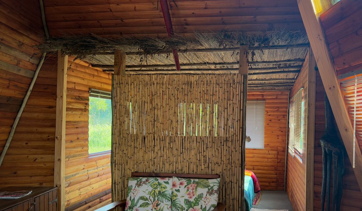
Cottage interiors rarely offer the blank canvas of a new-build room. Ceilings sit low, walls wander gently out of true, beams cross at unexpected heights and windows are small and deep-set. Rather than fighting these quirks, choose colours that let them speak. A chalky, muted shade softens an uneven wall; a highly saturated or glossy one highlights every lump and hollow. Before you buy a single tester pot, spend an evening looking at what is already there — the tone of the stone, the colour of the brick, the warmth of old floorboards or the grey-green of flagstones. Those materials are your starting palette, and any colour you introduce should sit comfortably alongside them.
It also helps to decide early how many colours the house can carry. Most cottages feel calmest with three or four shades used consistently throughout: a soft neutral for walls, a slightly deeper tone for woodwork or a feature, and one accent that appears in a bedroom or a small study. Repeating the same palette from room to room creates a sense of flow in a layout that is often cramped and irregular.
Read the Light in Every Room
Light in an old cottage changes dramatically through the day, and it will change your paint more than you expect. North-facing rooms receive cool, blue-grey light, which makes cool greys, lilacs and icy whites look flat and slightly dingy. Warm neutrals with a hint of pink, yellow or red restore the balance. South-facing rooms do the opposite: strong light intensifies colour, so you can afford cooler greens, soft blues and gentle greys that might look drab elsewhere. East-facing rooms are cool in the morning and warmer later; west-facing rooms glow gold in the afternoon, which can turn warm creams distinctly peachy.
Test properly rather than guessing. Paint at least two generous patches — A3 size or larger — on two different walls, including a corner where the light shifts. Apply two coats so the colour reads true, then live with it for forty-eight hours. Check it in the morning, at midday, in the evening and under your lamps at night. A colour that looks perfect at 11am can turn grey and lifeless by 7pm, and only a large, painted sample will tell you.
Create a Palette That Suits Old Materials
Traditional cottage materials — lime plaster, oak beams, brick, stone, terracotta — have an earthy, muted quality. Colours drawn from the same family always feel at home:
- Sage and olive greens, which sit beautifully against brick and wood and feel restful in a living room or study.
- Oatmeal, stone and clay neutrals, ideal for hallways and rooms with little natural light.
- Duck-egg blue and soft grey-blues, particularly good in bedrooms and south-facing kitchens.
- Muted terracotta and soft rose, which bring warmth to north-facing rooms without shouting.
- Chalky off-whites, the workhorses of a cottage scheme, useful on ceilings, woodwork and panelling.
If you have a large collection of patterned china, textiles or a busy rug, keep the walls quieter and let the accessories do the talking. If the room is plain, a slightly deeper wall colour adds the character the space is missing.
Whites, Neutrals and the Undertone Trap
Pure brilliant white is rarely kind to an old cottage. It makes dark beams look almost black, exposes every crack, and can feel clinical against honey-coloured stone. Choose an off-white with a visible undertone instead, and match that undertone to the room: warmer whites for north-facing spaces, cooler and greener whites for bright, sun-filled ones. Hold tester cards against the skirting, the floor and a window reveal — the same white can look creamy in one spot and shadowy in another.
Pay attention to your woodwork. Soft off-white eggshell on skirting, doors and architraves is the safe, traditional choice. Alternatively, paint woodwork in a shade one or two steps deeper than the walls to frame each room gently without harsh contrast.
Small Spaces, Mews Houses and Colour Drenching
In a narrow mews house, a galley kitchen or a tight cottage staircase, breaking up the walls with lots of different colours makes the space feel smaller. Instead, try colour drenching: painting walls, ceiling, woodwork and even the radiator in closely related tones so the eye travels uninterrupted and the corners visually dissolve. A low ceiling painted in the same soft shade as the walls will feel higher, not lower.
Use a lighter tone where light falls and let darker shades recede into alcoves, under stairs or in chimney recesses. Keep a small hallway in one warm, uniform colour rather than a white that turns cold, and consider painting the front door inside in a stronger shade — a small, deliberate accent that lifts the whole entrance.
Finishes, Features and Practical Choices
The finish matters as much as the colour. Dead-flat matt emulsion disguises imperfect plaster, while a chalky clay or lime-based paint lets old walls breathe — important in cottages built with lime mortar, wattle and daub or solid stone, where vinyl emulsion can trap moisture and cause flaking. Use washable eggshell on woodwork and in kitchens, and a low-sheen finish in bathrooms where steam is constant.
- Beams: don't fight them. Leave them bare or use a chalky neutral; stark white paint makes dark timber look heavy and contrived.
- Original features: panelling, picture rails and deep window reveals look best when painted in the wall colour or a whisper lighter.
- Radiators and pipework: painting them into the wall colour makes them disappear in small rooms.
- Sampling: always test on the actual wall, never from a colour chip held up in a shop.
Take your time. A cottage rewards colours that feel settled rather than fashionable, and a soft, well-tested scheme will look right for a decade rather than a season.


Older properties require careful survey work, sympathetic materials, and expert advice before you begin knocking down walls or altering original layouts.
Ferns, hostas, and foxgloves thrive in low light, bringing texture and colour to north-facing borders without demanding hours of direct sunshine.
From sash windows to inglenook fireplaces, recognising historic details helps you plan sensitive updates that protect a property's architectural character.
Bespoke alcove shelves can be built with basic tools and painted to match existing woodwork, adding useful storage without cluttering small rooms.